As many of you know, my combo living/dining room space can get the best of my design patience.
The living room is finally functioning well but my style has evolved and our 15-year-old Pottery Barn farmhouse table does not fit our home’s current aesthetics.

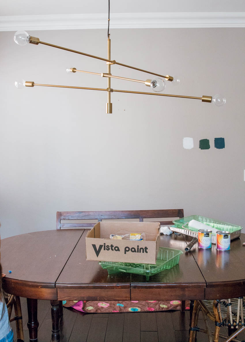
This was my attempt to hide the fact that the table was not complementing the space. The art was competing with the modern globe chandelier and the chairs weren’t working either.
Holiday Table Refresh
The Dunn Edwards Ash Gray greige paint was something I loved about the space. Plus, I painted the space only 3 years ago and I didn’t want to waste money or time painting again.
However, desperate times call for drastic measures.
I woke up one morning with a burning desire to paint this small space and define it from the living room. Here are 3 colors I tested:

From left to right: Benjamin Moore Super White, Crisp Romaine, Gentleman’s Gray
I did an Instastory poll and many of you swooned over the Crisp Romaine! Truth be told, I did too. But the whole point was to lighten the area and I was afraid the green might work the opposite way.
So of course, I opted for the Benjamin Moore Super White. Wait for it……
Dining Room Reveal

Guys, I am beyond thrilled with how this space turned out!
There is only one source of light from the left side of this room. So now that the whole space is white, I am much more gratified by the bright, light space.
As you can see, I added the @article DOT chairs* from the kitchen eating space and a minimalist Parachute Home linen tablecloth, that is so good, I can barely stand it! (The DOT chairs were gifted to me by @article.)
My whole design goal is to create a minimalistic holiday vibe and I feel quite happy with how it’s looking.

Because of my design budget, I can’t buy a new table right now. So what’s a girl to do?
Put a tablecloth on it! My table is oval and the tablecloth I love was only rectangular. I decided to buy it despite the shape because I want a rectangular table the next time around. I am so confident about this choice, I am committing to it even before knowing which exact table it will be.
Wow. I’m a risk taker, huh?
And why haven’t I added drapery to this space any sooner?
More and more I am convinced that drapery should be a must-have in any room. It automatically frames the space and adds a bold or soft accent to the windows.
I guess they don’t call window dressings for nuthin’!
I purposely chose lightweight linen drapes for this space because again, there is only one darn window. The last thing I want to do is block the precious sunlight from coming in!

Table Cloth Hack
To solve the problem of putting a rectangular tablecloth on on an oval table, I tied the corners of the cloth, making it look intentional. Plus it prevented the cloth from dropping onto the floor.
Guess what I used to bunch it together? A zip tie! Have you noticed there has been quite a variety of uses with zip ties! So happy this is one of them.
Then I decided to add some greenery for added visual interest and well, it’s just oh so pretty!
Holiday Table Decor Tips
Put faux pelts on chairs, floors, poufs, anything!
Adding a faux pelt adds texture, warmth and an instant cozy vibe to any space or piece of furniture. I swear I mention this ever post, but you need one two or three in your design life!
As for table settings, I love antique gold flatware. It is rustic and adds a pop of sheen and color to an otherwise neutral table.
Because the table is oval, I thought square plates would add variety to the table design. Don’t be afraid to play with different shapes and textures as you dress your table.


Garland as Art Wall
After removing the old artwork and painting the wall white, I was left with a big blank canvas. My creative mind got to thinkin’ all about holiday decorations.
My bestie’s high school son was selling garlands and wreaths and I ordered them not knowing exactly what I would do with them.
So happy I was able to help a good cause (high school baseball is very important you know) annnnd adding live greenery for the holidays is a must in my design book and it should be yours too!
For now, this live garland display is perfect because I can hang it right under the light and it is a simple yet impactful visual conversational piece for all my guests over dinner.

Another way to spruce up your windows is to add a wreath. Ribbon or not, wreaths are a quintessential holiday accent no one can ignore.

This may surprise you but I don’t like things too feminine or girly.
Whaaaa Anita, you seem so girly to me, you say. Yeah, I love cute clothes and shoes but bows seem too frilly. Adding a buffalo check bow to this wreath was a perfect balance.

Holiday Centerpieces
For the centerpiece, again, I wanted to go simple yet intentional.
A rustic bread bowl filled with some pretty dried wildflowers was all my table needed.
You can also try adding artichokes or other winter vegetation to the table. It is a great way to add life to your table!

Chandelier Height
Early on when I bought the chandelier, I hung it lower so that it would be the focal point of the space. Now that it is painted white, I raised the chandelier to a more appropriate distance.
Pro tip: chandeliers generally hang 20-24 inches from the ceiling based on a standard 8′ ceiling. Above a dining table, the diameter should be 2/3-3/4 of the table width.
Obvy I broke that rule because previously I wanted the go big or go home chandelier to be the star of the show.
Not anymore!

Holiday Bar Cart
I have been wanting a bar car for a long, long time. And what perfect time to get one!
Target had a sale and I snagged this one for a very reasonable price! I mean, $80 for an on-trend look alike? I saw the same one at West Elm for almost $300!

I have a few ideas up my sleeves on what to do with this wall space for the long term. But in the meantime, bar carts are great ways to style a corner.
It came with a rustic wood bottom shelf that I did not desire. Nothing wrong with it. I just didn’t prefer it for this space.
You guessed it. I had some leftover faux marble contact paper and it completely upgraded the cart. In an instant!
Aren’t home DIY hacks the best???

We love wine over here so instead of hard liquor, we stocked it with our favorite wine and stemware. That is the beauty of a cart. You can fill it with what you love! Love tea or coffee? Fill it with that instead! Do what you love my design bestie, that is my mantra.
Whew! I seriously feel like I have climbed Mount Everest and reached the near top with this project.
This space has given me the chills ever since we moved in and now finalllllly after 10 years, I am getting somewhere.
Thank you for following along and as I always say, this is *our* design journey together! Tell me what you think! Leave a comment or contact me to chat!
Happy day!

I think you’ve done an excellent job with the space. I hope it no longer gives you the chills because it now looks so festive!