


The biggest design question I get every day on both instagram and the blog is…. What color is that? Most often, it’s a shade of blue or green. These cool tones can make for tranquil spaces, bring a room back into nature, and lend balance to your home.
Now, I’ve finally sat down to give you my absolute favorite blues and greens all in one place! In this post, we’ll be getting down and dirty with some in-progress shots so you can see what these blues and greens really look like in the space.
Our Family’s First Green
I have always and forever been a blue tones kinda girl. They’re soft and welcoming, while having presence and impact! Touches of blue are threaded throughout our house, especially in the kitchen and family room, where we want the most out of this harmonious color.

So the first time we ever played with green in our spaces was for our Master Bedroom’s Board and Batten DIY back in December. Our paint color, Sherwin Williams “Underseas,” catapulted me into a growing love for the color green! Travis and I chose it because we wanted to create a sense of renewal in the space—which is exactly what green provides on the color theory spectrum.
Of course, being called “Underseas,” this shade definitely has more blue undertones—much of the reason this is such a relaxing color. It’s the additional infusion of yellow that invigorates the space, and gives us that refreshing quality green tones always bring into a room with them. It’s the perfect color to create a zen retreat for restorative rest.
Bathroom, Refreshed
…Actually, now that I’m thinking about it, maybe it was Sarah Sherman Samuel’s bathroom for Mandy Moore that piqued my initial interest in green. It was certainly my inspiration for a client project I’ve haven’t yet been able to photograph due to Covid. But I’m so excited to show it to you!

Image credit: Pinterest via Sara Sherman Samuel
You can tell from these inspo photos, the fireclay tiles are a really beautiful rosemary color that is sooooo soothing to the eye. In person, you feel like you are immersing yourself in nature! It’s the perfect escape from a busy day and the ideal color to wind down, while feeling recharged.
While greens with blue undertones create a more calming color, you can also achieve soft, muted spaces by implementing a more desaturated or faded green. The fireclay tile’s glaze definitely lends this diluting aspect, and I love the unique texture they add to the space!

Image credit: Pinterest via Sara Sherman Samuel
Pairing Your Greens
The fireclay tile looked so good in the bathroom that I’ve tried it again in another client project. And… I think it’s really confirming my newfound love for this versatile color! In this case, we’re applying tile to the fireplace in her living room/dining room.The client loves the color green, so it was easy to present this design palette to her.
For a livelier space, we’re using a more dynamic, patterned tile that incorporates both blue and green, and I think they will really bring the fireplace to life!
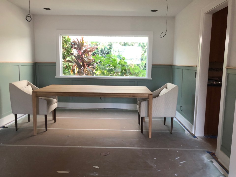
The fireplace won’t be the only star in this room—the dining room section got a major facelift too. So finding the right complementary green for the space’s overall color scheme was essential! I’m always thinking about cohesion throughout the house, and it’s important to consider how one space will flow into the next.
Here are all the green colors we considered:
- Oakmoss
- Artichoke
- Green Onyx
- Clary Sage
- Quietude
- Oyster Bay

Ultimately, we went with Oyster Bay, which was a very subtle sage green. Soothing is just one way to describe it! I love how color can transport your mind and mood into something so magical. And even soft and muted colors can make a major impact within your space!
Once dark and lacking any kind of character, our WHY came down to making this dining room a bright and energizing place to be. To start, I framed out the window to create a focal point. Then, we added wainscoting to the surrounding walls. What a difference it has made already!
When it’s finally all done, I can’t wait to go back and shoot this space to show you everything! We are patiently waiting for the fireclay tiles to be made and installed. I think the final effect will be magical. In the meantime, I know this next green is a real crowd pleaser. I have shown you this spectacular client project on IG but now it is time to show it here on my blog too!
Welcoming Outdoors Inside
This home was gutted down to the studs. We raised the roof super high and made one of the best great rooms for a small home ever! It doesn’t look small at all, but the entire home is only 1200 square feet!! Crazy, right?

With such a big space at the heart of a little home, it needed to feel warm and welcoming, while setting an upbeat tone for hosting guests. The green we chose in the open concept kitchen is the perfect combination of cozy and invigorating. In this case, our green is deeper, but it is such a natural tone that it feels quite fresh. We balanced it with a bright white, so it really pops!
Greens we considered here:
- Pewter Green
- Halycon Green
- Quietude

I designed the kitchen two-toned cabinets with white on top and Sherwin Williams Pewter green on bottom. We added brass accents for a modern feel. The clients are now happily enjoying this space and reported that their relationship has improved so much with each other and extended family due to the happy colors and well designed functional space!
Back to Black Blue
Of course, I always come back to blue. And my sexy black and blue kitchen is really coming together! It is always a pleasure to help design a space where my aesthetics are 100% aligned with a client. In this case, it couldn’t be more true.

For a kitchen with atmosphere, we opted for a neutral background and a moody dark blue (not navy!) with black undertones. Sherwin Williams “Inkwell” was the winner! But it took several rounds to decide. A big color choice can be daunting—give yourself the time you need to come around to a decision you’ll not only live with, but live in!
Take a look at all the Sherwin-Williams Colors that we considered:
- Inkwell
- Smoky Blue
- Moody Blue
- Mediterranean
- Slate Tile
- Naval
- Needlepoint Navy
- Studio Green Blue

We are installing black cafe appliances, and they’ll really sing against this deep blue. At the same time, “Inkwell” brings out the blue in the grey tiles and quartz countertops as well! Whether you’re working with a deep palette or in pastels, blue goes with everything, and there’s a time and place for every shade.
No matter how dark you want to go, here are a few tips on how to choose the right hue:
- Consider your lighting. Is it dark and dank, or so bright that it washes out the whole room? The right color should work with the quality light in the room, not against it. For example, you wouldn’t paint an already-dark room indigo! Use your shades to create balance.
- Pro tip: ALWAYS take the time to buy samples and paint swatches all over the room. If you’re wary of the extra work, you could always paint it on a piece of paper—but honestly, I like it on the wall. I always prime it first, too so that the underlying shade doesn’t taint the new color!
- What is your WHY? Are you trying to make a statement, or are you trying to freshen up a room to feel clean and neutral? The color you love on the wall may not suit the need you have in the room. Try to be objective about the overall effect each color will have on your space.

Remember, blues are neutrals just like a great pair of jeans that fit like a glove. You can dress them up or down, and some shades feel more casual than others. I personally love Madewell jeans, they are so comfy and high waisted (I hope mom jeans never go out of style!) —but your denim of choice may be a slinky dark low rise. However you want to play, there’s a blue for you!
Xo,
Anita


+ show Comments
- Hide Comments
add a comment