


Did you know that I’m an ambassador for Sherwin-Williams this year? I was so excited when they reached out! I have been using Sherwin-Williams in my clients’ homes and in my own for YEARS!
I consider myself the color psychology expert. Tell me a color you are dreaming about and I probably could tell you in a heartbeat the exact shade to use. From the study of psychology and work as a Marriage and Family Therapist, I also know that color can also greatly impact our mood and energy. So it’s no wonder that choosing a new shade for a space you’re in every single day can feel like such a conundrum.
One of the most asked questions I get from you is, “What paint color is that?” So, today I thought I would round up my favorite Sherwin-Williams paint colors that I used in my home and recent design projects for you!
What are we waiting for? Let’s get to it!
Whites
My #1 most frequently asked question is, “What white is that?” Of all the paint colors, this really seems to be the one that throws people into paralysis. Here is a comprehensive answer to the whites I chose for my own family.
Pure White SW 7005
I used this shade in my most frequently used and busiest spaces – my kitchen and family room. It’s a clean and bright white that stands up to bold accents – my DIY faux tile backsplash in the kitchen and statement tile fireplace in the family room.


Spare White SW 6203
I used this color in my mom’s powder room. This color was creamier yet retained a bright white vibe. It contrasted the smoky blue board and batten perfectly!

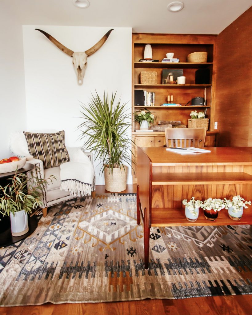
Snowbound SW 7004
This color is in my sister’s mid-century modern office. I used this barely-there beige white for my sister’s office because she didn’t want stark white. Don’t get me wrong, though! It was still white. No yellow tint. But it offered a cream warm tone that offsets the masculine wall paneling on the other side of the office.
Extra White SW 7006
This paint color is in the master bedroom. This super bright white feels modern and clean next to more rustic, desert-inspired furnishings. Before we added the underseas DIY board and batten wall, I needed to make our bedroom as Zen as possible. Too many years of our bedroom as the dumping ground of toys and unfolded laundry almost had me give up, so this last-ditch effort was so worth it!

Blues and Greens
For the full low-down, check out my complete guide to blues & greens!
Smoky Blue SW 7604
I used this color in my mom’s powder room. For this major DIY we wanted a statement color that still felt livable and soothing. Enter Smoky Blue SW 7604. It’s definitely a bold choice and was a dramatic transformation to the space but its gray undertone makes it soft, too.

Underseas SW 6214
This color was used in my master bedroom. Another major DIY project that needed a strong but soft shade. Similar to Smoky Blue SW 7604, this has a gray undertone that softens what could feel too bold and gives it a totally different vibe based on the time of day – bouncy in the day and moody at night.

Halcyon Green SW 6213
I used this color on a bathroom vanity in a recent client project. They just finished the bathroom, and I can’t visit and shoot the space! Here are the images that inspired us to choose that shade. After years of all white and marble bathrooms, it feels great to bring color into bathrooms; this Halcyon shade is an almost sage green and echoes the succulents and other greenery here in Southern California.

Image Credit: Pinterest
Grays
Front Porch SW 7651
We coated the cement pad in our backyard with this color. Here we wanted a clean look against the bold rug and wood pergola, and Front Porch SW 7651 was just the ticket. It’s a true gray with the slightest hint of blue/purple and reads super fresh, year after year.


Worldly Gray SW 7043
I’ve used this color in countless client homes for interior common walls like hallways, living rooms, dining rooms, and laundry rooms. This is really an MVP shade. It falls in the greige realm of warm, creamy grays and even has almost a hint of green. It looks lovely with a variety of marble and stone tiles.

Image Credit: Pinterest


Reflection SW 7661
This color was used on a bathroom vanity in a recent client project. All my client renovation projects were almost done or completed just before COVID-19, so I’m totally bummed I couldn’t get in yet to take pictures, but you can see how soothing and calm this shade is! It’s quite neutral and (wait for it) reflective and pairs beautifully with white trim.

Image Credit: Pinterest
I hope you find this post extremely helpful in narrowing down the most popular paint colors. I am so happy to be Sherwin-Williams Ambassador this year! There are literally hundreds and hundreds of colors to inspire you with. I intend to do my very best and saturate you with as many visually stunning colors as I can.
If you’re following me on Instagram, you know we are getting ready to paint the DIY Murphy Bed this week! I’ll be introducing the color I chose for the Desert Den this week, so stay tuned to find out which Sherwin-Williams color I choose! Who knows, it might inspire you to paint something while you are cocooning at home.
Happy Day!
Anita
This post was sponsored by Sherwin-Williams®. However, all opinions are my own. I love sharing what is true to my aesthetics and functionality in my home. Thank you for your support!


Love the colors that you chose for your rooms as we are moving into a new home my wife wants to paint the house from top to bottom with SW paints
Amazing and congrats on your new home! xo
HI Anita,
We are building a new fence and I’m looking for a stain colour.
What is the stain colour on the fence in the picture above with the blurb: Front Porch SW 7651 – We coated the cement pad in our backyard with this color. Here we wanted a clean look against the bold rug and wood pergola, and Front Porch SW 7651 was just the ticket. It’s a true gray with the slightest hint of blue/purple and reads super fresh, year after year.
Thanks!
Mary
so glad you love front porch!! we used SW Super Deck Exterior Stain in Natural xo
The Halcyon Green is beautiful with the brass hardware!
In our condo we have a large dining room/den. The walls are gloss Farrow & Ball red (blazer). The room has sliding doors facing north, so no direct sunlight. The vibe is eclectic with mainly antique furnishings (a variety of wood tones), including a large primitive storage unit which is also painted a similar red.
I think Halcyon Green is too dark for the walls, but would welcome any suggestions.
Thanks.
You know what? I would get a sample to see. It is actually pretty light in person. I always suggest getting a sample and letting it sit there so you can see how it changes throughout the day for you. xo
Loved the pure white SW7005
& the Halcyon Green SW 6213. The green is the first color I have been ever able to image in a bathroom.
I can’t wait to show you one of my bathroom client renovations with Halcyon Green as the vanity and the walls white!
Can you tell me more about your faux diy kitchen backsplash?
head to my blog post on it! http://anitayokota.com/diy-backsplash-wallpaper/
Some very beautiful colors, but I had a hard time figuring out what colors were what. Some rooms had a description underneath the room and others above the room. There are 5 rooms with white only 4 descriptions, but the rooms don’t match the color used. The last white described is Smokey Blue but it looks white to me. Blues & Greens, rooms 1 & 2 the description of the room you used these colors for do not match the color described, and on it goes. Hard to imagine a color in a room that says Color is underseas used in your master bedroom when I’m looking at a toilet.
The color comes first then you scroll down to the image described. 🙂
Help Anita! I’ve painted my home interior 10yrs ago in Nomadic Desert SW6107, & I’m ready for a change! I have light oak floors, white trim, brushed nickel hardware, dark kitchen cabinets, sienna bordeaux granite, travertine beveled subway tile backsplash, in a open floor plan. I could really use some help in choosing a new interior paint! Any suggestions, please?! I love your ideas! Thank you very much, Karen
I always love a good white wall to feel refreshed in a space! Good luck! xo
Love your ideas. I’m in the process to change my color in my living room and hallway entrance and would like to get some of your great idea and preference. I have a soft sage with white trimming which I love but need a change.
Start with what you are drawn to! Then find an inspo piece whether it is art or pillow or rug. Go from there. Good luck!
The colors that you show are beautiful and with your expertise all look warm and inviting. I am trying to begin an update as cost effectively as I can so that we can downsize as we are both retired or retiring.
Thank you,
Carol Osiecki
Thank you Carol! I am so glad I can help! xo
I really appreciate your impact painting my kitchen over faces south one bay window I have walnut stained cabinets crown molding and baseboards what white would you suggest would the pure white be alright and it would also be in our eating area
yes no-fail pure white!
Looking for a medium Smokey green gray or gray green for a bedroom which is soothing and relaxing. Any suggestions????? There are so many colors claiming to be a greenish gray that it is so confusing!!!! My walls look like a green gray zebra!!!
Thanks for any help!
i really like pewter green! xo
Love this helpful post so I’m pinning it! Here’s a color question as I’m totally drowning in color choices! Throw some suggestions to me for doors in my kitchen. I have Cypress wood walls. I’m painting my cabinets a warm white , like SW creamy or alabaster. I have a double east facing window, a half light door and single window facing west, and four french doors facing north onto a covered, screened porch. Currently, the doors are a brick/clay color but I want a fresher look. I’m thinking a medium shade of silvery green but not predominantly gray. I’m not into decorating with gray as it’s depressing to me. Lacks emotion. I have a lot of black, in my table & chairs, black & cream buffalo plaid curtains, etc. Can you point me in a direction? I’m open to any suggestions! Thank you!
i would match the trim wall and doors to the cabinet colors to be cohesive. good luck!
Like your ideas
Thank you so much!