Okay, I kinda wanted to save this for an epic, full-house reveal… But this is such a huge win, I couldn’t resist giving you a sneak peak!
We just celebrated a big milestone with our “Japandi” client. Last week, their minimalist kitchen rounded the final corner toward completion! This is the last, big push we needed in order to finalize their first floor renovation. And after months of construction-zone living, I know they’re overjoyed to use the space again.
This kitchen is at the heart of a full great room overhaul that has lightened and brightened our clients’ small home. Of course, demolition dust can be twice as inconvenient when it feels like there’s nowhere you can escape to. Add-on the fallout of delays caused by Covid-19, and this renovation’s success tastes all the sweeter!
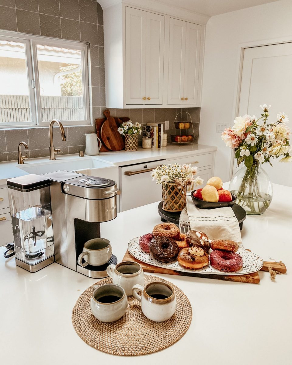
Naturally, we brought doughnuts to savor the moment together. 😉
A Hub for Hosting
I always want to bring a client back to their original WHY as we move through the different stages of a project together. For a slow-burn like this, it’s doubly important to manage stress during the renovation. One of the best ways to do that is to revisit your motivation as often as possible in order to make decisions from a place of alignment!
In this case, our clients want to be able to comfortably host their grandchildren when they visit from Japan. Prior to the renovation, each time the grandkids visited, there wasn’t really room for them to play—or even sleep. By opening up the living space, we create room for interaction and the opportunity for sleepovers right in the heart of their home.

The minimalist kitchen is central to this goal, providing a key place to connect. Before, additional counter space created a wall to the kitchen. Now, a welcoming island is large enough for all the grandkids to sit comfortably. And even when they’re not seated, the open concept design won’t cut anyone off from the fun.
Keeping things simple in the design helps create a stage for joy, allowing the details to take center stage. Our clients love an international, transitional style, so we looked to Japanese and Scandinavian styles to help inform our modern minimalism. It helps that both cultures have a lot of experience with small spaces!
Modern Minimalist Kitchen Features
Nothing has the power to transform a small space like adding light. To achieve a bright, open plan kitchen, we removed the ‘wall’ of cabinets, put in a skylight, and painted the space with a sleek white. Both Japanese and Scandi-styles rely on neutral tones and natural light to really shine. It did the trick! The owners say now they’re happy to walk into the space.

And it’s no wonder: there are so many joyful details that take this minimalist kitchen from basic to brilliant! The waterfall detail on the island is one of my favorites. This clean line keeps the kitchen contemporary and underscores the geometric elements woven throughout. The seamless-look elevates the whole design, giving it a modern edge.
The white shaker style cabinets blend those modern lines with a more transitional look that keeps the room feeling homey. The oven isn’t in yet, but you can see the custom white oak banding on the range hood! I love what is possible when a prefab design can be made bespoke. A hi-lo approach can help really use your money where it counts!
I’m so happy with where we splurged: the white oak drip bar under the farm sink is such an elegant touch. Bringing in the natural wood grain with geometric precision is a Japanese nod. As is the faceted cabinet hardware, which reminds me of chopsticks! The modern shape in a burnished gold brings just the right amount of wow-factor, while staying in the neutral palette.

It’s especially blingy against Fireclay Tile, which is a subtle green-grey. I wish the photos gave you the full impact! We used the “Summit” tile, which features a hand painted pattern shaped like Japanese mountains. It brings a beautiful texture that adds depth to our minimalist color palette.
Building in Balance
I polished the whole room off with chairs from Studio Mcgee x Target—which were SUCH a win! Obviously the price point is great, and they tie into the Scandinavian theme without going too farmhouse-y. The black helps to temper the overall design, and is just the right touch to balance all of the bright whites in the room.
I know they don’t have a stove yet, but I still want the owners to hang out in this new room! So along with the chairs, I wanted to make sure they have a little coffee station. They LOVE coffee, so it’s a nice touch to make them feel at home while they wait for the rest of the room to come together.

Seeing this space come to life has me FIRED UP to take on the living room & dining room adjacent to the kitchen! I can’t wait to show you the finished product. In the meantime, I hope you enjoy this space as much as the clients do.
Xo,
Anita

+ show Comments
- Hide Comments
add a comment